Prometheus Black-Scholes Option PricesThe Black-Scholes Model is an option pricing model developed my Fischer Black and Myron Scholes in 1973 at MIT. This is regarded as the most accurate pricing model and is still used today all over the world. This script is a simulated Black-Scholes model pricing model, I will get into why I say simulated.
What is an option?
An option is the right, but not the obligation, to buy or sell 100 shares of a certain stock, for calls or puts respective, at a certain price, on a certain date (assuming European style options, American options can be exercised early). The reason these agreements, these contracts exist is to provide traders with leverage. Buying 1 contract to represent 100 shares of the underlying, more often than not, at a cheaper price. That is why the price of the option, the premium , is a small number. If an option costs $1.00 we pay $100.00 for it because 100 shares * 1 dollar per share = 100 dollars for all the shares. When a trader purchases a call on stock XYZ with a strike of $105 while XYZ stock is trading at $100, if XYZ stock moves up to $110 dollars before expiration the option has $5 of intrinsic value. You have the right to buy something at $105 when it is trading at $110. That agreement is way more valuable now, as a result the options premium would increase. That is a quick overview about how options are traded, let's get into calculating them.
Inputs for the Black-Scholes model
To calculate the price of an option we need to know 5 things:
Current Price of the asset
Strike Price of the option
Time Till Expiration
Risk-Free Interest rate
Volatility
The price of a European call option 𝐶 is given by:
𝐶 = 𝑆0 * Φ(𝑑1) − 𝐾 * 𝑒^(−𝑟 * 𝑇) * Φ(𝑑2)
where:
𝑆0 is the current price of the underlying asset.
𝐾 is the strike price of the option.
𝑟 is the risk-free interest rate.
𝑇 is the time to expiration.
Φ is the cumulative distribution function of the standard normal distribution.
𝑑1 and 𝑑2 are calculated as:
𝑑1 = (ln(𝑆0 / 𝐾) + (𝑟 + (𝜎^2 / 2)) * 𝑇) / (𝜎 * sqrt(𝑇))
𝑑2= 𝑑1 - (𝜎 * sqrt(𝑇))
𝜎 is the volatility of the underlying asset.
The price of a European put option 𝑃 is given by:
𝑃 = 𝐾 * 𝑒^(−𝑟 * 𝑇) * Φ(−𝑑2) − 𝑆0 * Φ(−𝑑1)
where 𝑑1 and 𝑑2 are as defined above.
Key Assumptions of the Black-Scholes Model
The price of the underlying asset follows a lognormal distribution.
There are no transaction costs or taxes.
The risk-free interest rate and volatility of the underlying asset are constant.
The underlying asset does not pay dividends during the life of the option.
The markets are efficient, meaning that all known information is already reflected in the prices.
Options can only be exercised at expiration (European-style options).
Understanding the Script
Here I have arrows pointing to specific spots on the table. They point to Historical Volatility and Inputted DTE . Inputted DTE is a value the user may input to calculate premium for options that expire in that many days. Historical Volatility , is the value calculated by this code.
length = 252 // One year of trading days
hv = ta.stdev(math.log(close / close ), length) * math.sqrt(365)
And then made daily like the Black-Scholes model needs from this step in the code.
hv_daily = request.security(syminfo.tickerid, "1D", hv)
The user has the option to input their own volatility to the Script. I will get into why that may be advantageous in a moment. If the user chooses to do so the Script will change which value it is using as so.
hv_in_use = which_sig == false ? hv_daily : sig
There is a lot going on in this image but bare with me, it will all make sense by the end. The column to the far left of both the green and maroon colored columns represent the strike price of the contract, if the numbers are white that means the contract is out of the money, gray means in the money. If you remember from the calculation this represents the price to buy or sell shares at, for calls or puts respective. The column second from the left shows a value for Simulated Market Price . This is a necessary part of this script so we can show changes in implied volatility. See, when we go to our brokerages and look at options prices, sure the price was calculated by a pricing model, but that is rarely the true price of the model. Market participant sentiment affects this value as their estimates for future volatility, Implied Volatility changes.
For example, if a call option is supposed to be worth $1.00 from the pricing model, however everyone is bullish on the stock and wants to buy calls, the premium may go to $1.20 from $1.00 because participants juice up the Implied Volatility . Higher Implied Volatility generally means higher premium, given enough time to expiration. Buying an option at $0.80 when it should be worth $1.00 due to changes in sentiment is a big part of the Quant Trading industry.
Of course I don't have access to an actual exchange so get prices, so I modeled participant decisions by adding or subtracting a small random value on the "perfect premium" from the Black-Scholes model, and solving for implied volatility using the Newton-Raphson method.
It is like when we have speed = distance / time if we know speed and time , we can solve for distance .
This is what models the changing Implied Volatility in the table. The other column in the table, 3rd from the left, is the Black-Scholes model price without the changes of a random number. Finally, the 4th column from the left is that Implied Volatility value we calculated with the modified option price.
More on Implied Volatility
Implied Volatility represents the future expected volatility of an asset. As it is the value in the future it is not know like Historical Volatility, only projected. We provide the user with the option to enter their own Implied Volatility to start with for better modeling of options close to expiration. If you want to model options 1 day from expiration you will probably have to enter a higher Implied Volatility so that way the prices will be higher. Since the underlying is so close to expiration they are traded so much and traders manipulate their Implied Volatility , increasing their value. Be safe while trading these!
Thank you all for clicking on my indicator and reading this description! Happy coding, Happy trading, Be safe!
Good reference: www.investopedia.com
Cerca negli script per "Implied volatility"

VOLQ Sigma TableThis indicator replaces the implied volatility of VOLQ with the daily volatility and reflects that value into the price on the NDX chart to create the VOLQ standard deviation table.
It will only be useful for stocks related to the Nasdaq Index.
For example, NDX, QQQ or so.
And we want to predict the range of weekly fluctuations by plotting those values as a line in the future.
It is expressed as High 2σ by adding the standard deviation 2 sigma value of the VOLQ value from last week's closing price.
It is expressed as High 1σ by adding the standard deviation 1 sigma value of the VOLQ value from last week's closing price.
It is expressed as Low 1σ by subtracting the standard deviation 1 sigma value of the VOLQ value from the closing price of the previous week.
It is expressed as Low 2σ by subtracting the standard deviation 2 sigma value of the VOLQ value from last week's closing price.
1day predicts daily fluctuations.
2day predicts 2-day fluctuations.
3day predicts 3-day fluctuations.
4day predicts 4-day fluctuations.
5day predicts 5-day fluctuations.
In the settings you can select the start date to display the VOLQ line via input.
-----------------------------
What motivated me to create this indicator?
From my point of view, the reason for classifying vix volq historical volatility (realized volatility) is that the most important point is that VIXX and VolQ are calculated from implied volatility. It can be standardized as one-month volatility. There are many strike prices, but exchanges use the implied volatility of options traded on their own exchanges.
Because historical volatility depends on how the period is set, to compare with VIXX, we compare it with a month, that is, 20 business days. One-month implied volatility means (actually different depending on the strike price), because option traders expect that the one-month volatility will be this much, and it is the volatility created by volatility trading.
So we see it as the volatility expected by derivatives traders, especially volatility traders.
I'm trying to infer what the market thinks will fluctuate this much from the numbers generated there.

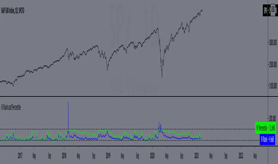
IV Rank and Percentile"All stocks in the market have unique personalities in terms of implied volatility (their option prices). For example, one stock might have an implied volatility of 30%, while another has an implied volatility of 50%. Even more, the 30% IV stock might usually trade with 20% IV, in which case 30% is high. On the other hand, the 50% IV stock might usually trade with 75% IV, in which case 50% is low.
So, how do we determine whether a stock's option prices (IV) are relatively high or low?
The solution is to compare each stock's IV against its historical IV levels. We can accomplish this by converting a stock's current IV into a rank or percentile.
Implied Volatility Rank (IV Rank) Explained
Implied volatility rank (IV rank) compares a stock's current IV to its IV range over a certain time period (typically one year).
Here's the formula for one-year IV rank:
(Current IV - 1 Year Low IV) / (1 Year High IV - 1 Year Low IV) * 100
For example, the IV rank for a 20% IV stock with a one-year IV range between 15% and 35% would be:
(20% - 15%) / (35% - 15%) = 25%
An IV rank of 25% means that the difference between the current IV and the low IV is only 25% of the entire IV range over the past year, which means the current IV is closer to the low end of historical levels of implied volatility.
Furthermore, an IV rank of 0% indicates that the current IV is the very bottom of the one-year range, and an IV rank of 100% indicates that the current IV is at the top of the one-year range.
Implied Volatility Percentile (IV Percentile) Explained
Implied volatility percentile (IV percentile) tells you the percentage of days in the past that a stock's IV was lower than its current IV.
Here's the formula for calculating a one-year IV percentile:
Number of trading days below current IV / 252 * 100
As an example, let's say a stock's current IV is 35%, and in 180 of the past 252 days, the stock's IV has been below 35%. In this case, the stock's 35% implied volatility represents an IV percentile equal to:
180/252 * 100 = 71.42%
An IV percentile of 71.42% tells us that the stock's IV has been below 35% approximately 71% of the time over the past year.
Applications of IV Rank and IV Percentile
Why does it help to know whether a stock's current implied volatility is relatively high or low? Well, many traders use IV rank or IV percentile as a way to determine appropriate strategies for that stock.
For example, if a stock's IV rank is 90%, then a trader might look to implement strategies that profit from a decrease in the stock's implied volatility, as the IV rank of 90% indicates that the stock's current IV is at the top of its range over the past year (for a one-year IV rank).
On the other hand, if a stock's IV rank is 0%, then traders might look to implement strategies that profit from an increase in implied volatility, as the IV rank of 0% indicates the stock's current implied volatility is at the bottom of its range over the past year."
This script approximates IV by using the VIX products, which calculate the 30-day implied volatility of the specified security.
*Includes an option for repainting -- default value is true, meaning the script will repaint the current bar.
False = Not Repainting = Value for the current bar is not repainted, but all past values are offset by 1 bar.
True = Repainting = Value for the current bar is repainted, but all past values are correct and not offset by 1 bar.
In both cases, all of the historical values are correct, it is just a matter of whether you prefer the current bar to be realistically painted and the historical bars offset by 1, or the current bar to be repainted and the historical data to match their respective price bars.
As explained by TradingView,`f_security()` is for coders who want to offer their users a repainting/no-repainting version of the HTF data.
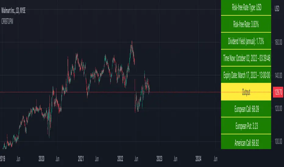
Cox-Ross-Rubinstein Binomial Tree Options Pricing Model [Loxx]Cox-Ross-Rubinstein Binomial Tree Options Pricing Model is an options pricing panel calculated using an N-iteration (limited to 300 in Pine Script due to matrices size limits) "discrete-time" (lattice based) method to approximate the closed-form Black–Scholes formula. Joshi (2008) outlined varying binomial options pricing model furnishes a numerical approach for the valuation of options. Significantly, the American analogue can be estimated using the binomial tree. This indicator is the complex calculation for Binomial option pricing. Most folks take a shortcut and only calculate 2 iterations. I've coded this to allow for up to 300 iterations. This can be used to price American Puts/Calls and European Puts/Calls. I'll be updating this indicator will be updated with additional features over time. If you would like to learn more about options, I suggest you check out the book textbook Options, Futures and other Derivative by John C Hull.
***This indicator only works on the daily timeframe!***
A quick graphic of what this all means:
In the graphic, "n" are the steps, in this case we can do up to 300, in production we'd need to do 5-15K. That's a lot of steps! You can see here how the binomial tree fans out. As I said previously, most folks only calculate 2 steps, here we are calculating up to 300.
Want to learn more about Simple Introduction to Cox, Ross Rubinstein (1979) ?
Watch this short series "Introduction to Basic Cox, Ross and Rubinstein (1979) model."
Limitations of Black Scholes options pricing model
This is a widely used and well-known options pricing model, factors in current stock price, options strike price, time until expiration (denoted as a percent of a year), and risk-free interest rates. The Black-Scholes Model is quick in calculating any number of option prices. But the model cannot accurately calculate American options, since it only considers the price at an option's expiration date. American options are those that the owner may exercise at any time up to and including the expiration day.
What are Binomial Trees in options pricing?
A useful and very popular technique for pricing an option involves constructing a binomial tree. This is a diagram representing different possible paths that might be followed by the stock price over the life of an option. The underlying assumption is that the stock price follows a random walk. In each time step, it has a certain probability of moving up by a certain percentage amount and a certain probability of moving down by a certain percentage amount. In the limit, as the time step becomes smaller, this model is the same as the Black–Scholes–Merton model.
What is the Binomial options pricing model ?
This model uses a tree diagram with volatility factored in at each level to show all possible paths an option's price can take, then works backward to determine one price. The benefit of the Binomial Model is that you can revisit it at any point for the possibility of early exercise. Early exercise is executing the contract's actions at its strike price before the contract's expiration. Early exercise only happens in American-style options. However, the calculations involved in this model take a long time to determine, so this model isn't the best in rushed situations.
What is the Cox-Ross-Rubinstein Model?
The Cox-Ross-Rubinstein binomial model can be used to price European and American options on stocks without dividends, stocks and stock indexes paying a continuous dividend yield, futures, and currency options. Option pricing is done by working backwards, starting at the terminal date. Here we know all the possible values of the underlying price. For each of these, we calculate the payoffs from the derivative, and find what the set of possible derivative prices is one period before. Given these, we can find the option one period before this again, and so on. Working ones way down to the root of the tree, the option price is found as the derivative price in the first node.
Inputs
Spot price: select from 33 different types of price inputs
Calculation Steps: how many iterations to be used in the Binomial model. In practice, this number would be anywhere from 5000 to 15000, for our purposes here, this is limited to 300
Strike Price: the strike price of the option you're wishing to model
% Implied Volatility: here you can manually enter implied volatility
Historical Volatility Period: the input period for historical volatility; historical volatility isn't used in the CRRBT process, this is to serve as a sort of benchmark for the implied volatility,
Historical Volatility Type: choose from various types of implied volatility, search my indicators for details on each of these
Option Base Currency: this is to calculate the risk-free rate, this is used if you wish to automatically calculate the risk-free rate instead of using the manual input. this uses the 10 year bold yield of the corresponding country
% Manual Risk-free Rate: here you can manually enter the risk-free rate
Use manual input for Risk-free Rate? : choose manual or automatic for risk-free rate
% Manual Yearly Dividend Yield: here you can manually enter the yearly dividend yield
Adjust for Dividends?: choose if you even want to use use dividends
Automatically Calculate Yearly Dividend Yield? choose if you want to use automatic vs manual dividend yield calculation
Time Now Type: choose how you want to calculate time right now, see the tool tip
Days in Year: choose how many days in the year, 365 for all days, 252 for trading days, etc
Hours Per Day: how many hours per day? 24, 8 working hours, or 6.5 trading hours
Expiry date settings: here you can specify the exact time the option expires
Take notes:
Futures don't risk free yields. If you are pricing options of futures, then the risk-free rate is zero.
Dividend yields are calculated using TradingView's internal dividend values
This indicator only works on the daily timeframe
Included
Option pricing panel
Loxx's Expanded Source Types
Rule of 16 - LowerThe "Rule of 16" is a simple guideline used by traders and investors to estimate the expected annualized volatility of the S&P 500 Index (SPX) based on the level of the CBOE Volatility Index (VIX). The VIX, often referred to as the "fear gauge" or "fear index," measures the market's expectations for future volatility. It is calculated using the implied volatility of a specific set of S&P 500 options.
The Rule of 16 provides a rough approximation of the expected annualized percentage change in the S&P 500 based on the VIX level. Here's how it works:
Find the VIX level: Look up the current value of the VIX. Let's say it's currently at 20.
Apply the Rule of 16: Divide the VIX level by 16. In this example, 20 divided by 16 equals 1.25.
Result: The result of this calculation represents the expected annualized percentage change in the S&P 500. In this case, 1.25% is the estimated annualized volatility.
So, according to the Rule of 16, a VIX level of 20 suggests an expected annualized volatility of approximately 1.25% in the S&P 500.
Here's how you can use the Rule of 16:
Market Sentiment: The VIX is often used as an indicator of market sentiment. When the VIX is high (above its historical average), it suggests that investors expect higher market volatility, indicating potential uncertainty or fear in the markets. Conversely, when the VIX is low, it suggests lower expected volatility and potentially more confidence in the markets.
Risk Management: Traders and investors can use the Rule of 16 to estimate the potential risk associated with their portfolios. For example, if you have a portfolio of S&P 500 stocks and the VIX is at 20, you can use the Rule of 16 to estimate that the annualized volatility of your portfolio may be around 1.25%. This information can help you make decisions about position sizing and risk management.
Option Pricing: Options traders may use the Rule of 16 to get a quick estimate of the implied annualized volatility priced into S&P 500 options. It can help them assess whether options are relatively expensive or cheap based on the VIX level.
It's important to note that the Rule of 16 is a simplification and provides only a rough estimate of expected volatility. Market conditions and the relationship between the VIX and the S&P 500 can change over time. Therefore, it should be used as a guideline rather than a precise forecasting tool. Traders and investors should consider other factors and use additional analysis to make informed decisions.

SPY Options Targets -IV Expected MoveWhat this indicator is?
This tool turns option implied volatility into two things:
1) Expected move levels on the SPY chart for a chosen time horizon
2) Estimated option premium targets if SPY reaches those levels
It is built to answer three trading questions:
1) How far can SPY reasonably move in my holding window
2) What SPY levels should I use for profit targets or invalidation
3) If SPY hits those levels, what option price is a realistic target
What the bands mean on the SPY chart
The bands are expected move levels on the underlying, recalculated each bar from the selected option’s implied volatility.
One sigma band
The teal band is the expected one standard deviation move over the next Horizon minutes. In practice, this is a normal move zone for that holding window.
Two sigma band
The orange band is the expected two standard deviation move over the next Horizon minutes. In practice, this is a large move zone for that holding window.
How to interpret value
If price is near the middle of the bands, the market is behaving normally for that window.
If price approaches the one sigma band, the move is extended for that window.
If price approaches the two sigma band, the move is unusually large for that window and you should expect either strong continuation or sharp mean reversion depending on market context.
What the table means and how to use it
IV
Implied volatility solved from the selected option price. Higher IV widens the bands and increases option targets.
DTE
Days to expiry of the selected option. Near expiry options can change faster and IV can shift quickly.
H move 1 sigma
The projected one sigma SPY move in dollars for the selected Horizon minutes. This is the key number for planning.
Opt at plus 1 sigma and minus 1 sigma
If SPY reaches the one sigma upper band or the one sigma lower band, the indicator estimates what your selected option should be worth at that moment, assuming implied volatility does not change.
Opt at plus 2 sigma and minus 2 sigma
Same idea for the two sigma bands.
Now opt px
Current option price for reference.
.................................................................................................................
How to trade using it?
Step 1 Pick the right option input
Choose the same expiry you plan to trade and pick a liquid contract, ideally at the money or near the money. This makes the IV reading more representative of the current tape.
Step 2 Set the horizon to your holding time
If you typically hold 15 to 30 minutes, set Horizon minutes to 15 or 30.
If you typically hold 60 to 120 minutes, set it accordingly.
This matters because the bands represent expected move for that exact window.
Step 3 Use the bands to define trade planning
For a long bias
Entry is your setup. The bands are used for targets and risk.
Target 1 is the one sigma upper band.
Target 2 is the two sigma upper band if momentum supports continuation.
Invalidation can be defined as losing the mid zone and failing to reclaim, or a clear level based stop. The indicator does not choose your stop. It gives your realistic upside distance.
For a short bias
Target 1 is the one sigma lower band.
Target 2 is the two sigma lower band if momentum supports continuation.
Invalidation can be defined similarly using your structure.
Step 4 Use the option targets as profit taking levels
Once you enter an option trade, ignore random premium swings and anchor to the table.
Common approach
Take partial profit when the option approaches the plus or minus one sigma target value.
Hold a smaller runner for the plus or minus two sigma target value.
If SPY hits the one sigma band but the option is far below the table target, it usually means implied volatility is dropping. Reduce expectations or exit earlier.
If SPY hits the one sigma band and the option is above the table target, it usually means implied volatility expanded. Consider taking profits sooner because this extra premium can mean revert.
Step 5 Use it to choose strikes
Before entering, check whether your desired option profit requires SPY to travel to the two sigma band within your horizon.
If yes, that is a lower probability trade for that window.
If your plan is achievable around the one sigma band, it is typically more realistic.
..................................................................................................................
Practical examples
Scalp example
Horizon 30 minutes.
If H move 1 sigma is about 1 dollar, then expecting a 3 dollar SPY move in 30 minutes is a two to three sigma expectation and should be treated as a low probability scalp unless a news event is active.
Intraday example
Horizon 120 minutes.
If H move 1 sigma is about 2 dollars, a 2 dollar move is a reasonable target and a 4 dollar move is the stretch target.
Important limitations
Implied volatility changes
The option target prices assume IV stays constant. In real markets IV can change during the move, especially on 0DTE, around news, or during sharp selloffs. Treat option targets as a baseline estimate.
Not a standalone signal
This indicator does not generate buy or sell signals. Combine it with your entry model, structure, or momentum confirmation.
Liquidity matters
Very wide bid ask spreads can distort the inferred IV. Use liquid contracts.
Suggested defaults for SPY
Use a liquid near the money option for the current expiry.
Horizon 30 for scalps, 60 for intraday, 120 for swings.
Keep expiry time at 16:00 New York.
Disclaimer
This script is for educational and informational purposes only and is not financial advice. Options involve risk and may not be suitable for all traders.

GME Warrant Tracker [theUltimator5]The GME Warrant Tracker was designed to be used for GME warrants tracking. The theory behind this indicator is that warrants are priced similarly to options and generally follow the same Greeks. With that assumption, we can break down the price of the warrants by using known Greeks to estimate either the theoretical price, or even estimate Implied Volatility (IV).
The base settings for this indicator plot the calculated IV, the theoretical price (there are multiple methods of calculation which I will discuss later) and the current warrant price.
You can toggle on or off all of these plots to display only what you want to track.
For example, you can simply track the difference between the theoretical price and the current price to see if warrants are trading at a premium or a discount vs what the indicator calculates it to be.
Calculating implied volatility is extremely difficult and must be approximated.
The theoretical warrant price produced by this indicator depends primarily on the volatility input (σ) used in the Black–Scholes pricing model.
This script supports five distinct methods for approximating σ, each extracting different information from the market.
1) Close-to-Close Historical Volatility
Close-to-Close computes the standard deviation of daily close-to-close returns and uses a lookback window scaled to time-to-expiry. As the expiration approaches, the lookback window tightens, giving a more responsive volatility approximation relative to time-to-expiry.
This option produces conservative approximations for volatility, and may lag actual volatility intraday.
2) Parkinson High-Low Volatility
Parkinson High-Low volatility uses daily high and low prices to calculate intraday trading range for a more responsive estimation to volatility. It ignores opening and close gaps, so overnight volatility is not accounted for.
This option produces higher theoretical volatility during choppy price action and can over estimate actual volatility.
3) Garman–Klass Volatility
Garman–Klass volatility is a way to estimate how much price is fluctuating by using the open, high, low, and close for each period. Because it draws on multiple intraperiod price points (not just the range or close-to-close moves), it typically produces a tighter, more informative volatility estimate than simpler approaches. It’s often most helpful when gaps occur and when the open and close carry meaningful information about the session’s trading.
4)Yang–Zhang Volatility
The Yang–Zhang volatility estimator is designed to account for both opening jumps and price drift. It estimates volatility by combining overnight (close-to-open) variance, intraday (open-to-close) variance, and a weighted Rogers–Satchell component using OHLC data, often yielding a more robust measure than simpler close-to-close style estimators.
5) Option price
By default, the indicator uses the call option strike dated closest to the warrant expiration date. Since the Greeks for both the warrants and the
options are assumed to be equivalent with a minor difference in theta (time-to-expiry), the theoretical price of the warrants closely matches the trade price of the call strike chosen.
There is a table that can be enabled (off by default because it is large and fills entire screen on mobile) which shows all the configuration settings and Greeks.
You can also manually adjust the "dilution" factor for the warrants, which shifts the number of active warrants and moves the count into the shares outstanding for the underlying (GME). The reason for this is that as warrants get exercised, the total quantity of warrants in circulation decreases and the the total quantity of shares outstanding increases.
Since this indicator was built around the single warrant, ticker NYSE: GME/W, it is only meant to be used with NYSE:GME. Any other ticker will not work properly with this indicator.

Support and Resistance levels from Options DataINTRODUCTION
This script is designed to visualize key support and resistance levels derived from options data on TradingView charts. It overlays lines, labels, and boxes to highlight levels such as Put Walls (gamma support), Call Walls (gamma resistance), Gamma Flip points, Vanna levels, and more.
These levels are intended to help traders identify potential areas of price magnetism, reversal, or breakout based on options market dynamics. All calculations and visualizations are based on user-provided data pasted into the input field, as Pine Script cannot directly fetch external options data due to platform limitations (explained below).
For convenience, my website allows users to interact with a bot that will generate the string for up to 30 tickers at once getting nearly real-time data on demand (data is cached for 15min). With the output string pasted into this indicator, it's a bliss to shuffle through your portfolio and see those levels for each ticker.
The script is open-source under TradingView's terms, allowing users to study, modify, and improve it. It draws inspiration from common options-derived metrics like gamma exposure and vanna, which are widely discussed in financial literature. No external code is copied without rights; all logic is original or based on standard mathematical formulas.
How the Options Levels Are Calculated
The levels displayed by this script are not computed within Pine Script itself—instead, they rely on pre-calculated values provided by the user (via a pasted data string). These values are derived from options chain data fetched from financial APIs (e.g., using libraries like yfinance in Python). Here's a step-by-step overview of how these levels are generally calculated externally before being input into the script:
Fetching Options Data:
Historical and current options chain data for a ticker (e.g., strikes, open interest, volume, implied volatility, expirations) is retrieved for near-term expirations (e.g., up to 90 days).
Current stock price is obtained from recent history.
Gamma Support (Put Wall) and Resistance (Call Wall):
Gamma Calculation: For each option, gamma (the rate of change of delta) is computed using the Black-Scholes formula:
gamma = N'(d1) / (S * sigma * sqrt(T))
where S is the stock price, K is the strike, T is time to expiration (in years), sigma is implied volatility, r is the risk-free rate (e.g., 0.0445), and N'(d1) is the normal probability density function.
Weighted gamma is multiplied by open interest and aggregated by strike.
The Put Wall is the strike below the current price with the highest weighted gamma from puts (acting as support).
The Call Wall is the strike above the current price with the highest weighted gamma from calls (acting as resistance).
Short-term versions focus on strikes closer to the money (e.g., within 10-15% of the price).
Gamma Flip Level:
Net dealer gamma exposure (GEX) is calculated across all strikes:
GEX = sum (gamma * OI * 100 * S^2 * sign * decay)
where sign is +1 for calls/-1 for puts, and decay is 1 / sqrt(T).
The flip point is the price where net GEX changes sign (from positive to negative or vice versa), interpolated between strikes.
Vanna Levels:
Vanna (sensitivity of delta to volatility) is calculated:
vanna = -N'(d1) * d2 / sigma
where d2 = d1 - sigma * sqrt(T).
Weighted by open interest, the highest positive and negative vanna strikes are identified.
Other Levels:
S1/R1: Significant strikes with high combined open interest and volume (80% OI + 20% volume), below/above price for support/resistance.
Implied Move: ATM implied volatility scaled by S * sigma * sqrt(d/365) (e.g., for 7 days).
Call/Put Ratio: Total call contracts divided by put contracts (OI + volume).
IV Percentage: Average ATM implied volatility.
Options Activity Level: Average contracts per unique strike, binned into levels (0-4).
Stop Loss: Dynamically set below the lowest support (e.g., Put Wall, Gamma Flip), adjusted by IV (tighter in low IV).
Fib Target: 1.618 extension from Put Wall to Call Wall range.
Previous day levels are stored for comparison (e.g., to detect Call Wall movement >2.5% for alerts).
Effect as Support and Resistance in Technical Trading
Options levels like gamma walls influence price action due to market maker hedging:
Put Wall (Gamma Support): High put gamma below price creates a "magnet" effect—market makers buy stock as price falls, providing support. Traders might look for bounces here as entry points for longs.
Call Wall (Gamma Resistance): High call gamma above price leads to selling pressure from hedging, acting as resistance. Rejections here could signal trims, sells or even shorts.
Gamma Flip: Where gamma exposure flips sign, often a volatility pivot—crossing it can accelerate moves (bullish above, bearish below).
Vanna Levels: Positive/negative vanna indicate volatility sensitivity; crosses may signal regime shifts.
Implied Move: Shows expected range; prices outside suggest overextension.
S1/R1 and Fib Target: Volume/OI clusters act as classic S/R; Fib extensions project upside targets post-breakout.
In trading, these are not guarantees—combine with TA (e.g., volume, trends). High activity levels imply stronger effects; low CP ratio suggests bearish sentiment. Alerts trigger on proximities/crosses for awareness, not advice.
Limitations of the TradingView Platform for Data Pulling
TradingView's Pine Script is sandboxed for security and performance:
No direct internet access or API calls (e.g., can't fetch yfinance data in-script).
Limited to chart data/symbol info; no real-time options chains.
Inputs are static per load; updates require manual pasting.
Caching isn't persistent across sessions.
This prevents dynamic data pulling, ensuring scripts remain lightweight but requiring external tools for fresh data.
Creative Solution for On-Demand Data Pulling
To overcome these limitations, users can use external tools or scripts (e.g., Python-based) to fetch and compute levels on demand. The tool processes tickers, generates a formatted string (e.g., "TICKER:level1,level2,...;TIMESTAMP:unix;"), and users paste it into the script's input. This keeps data fresh without violating platform rules, as computation happens off-platform. For example, run a local script to query APIs and output the string—adaptable for any ticker.
Script Functionality Breakdown
Inputs: Custom data string (parsed for levels/timestamp); toggles for short-term/previous/Vanna/stop loss; style options (colors, transparency).
Parsing: Extracts levels for the chart symbol; gets timestamp for "updated ago" display.
Drawing: Lines/labels for levels; boxes for gamma zones/implied move; clears old elements on updates.
Info Panel: Top-right summary with metrics (CP ratio, IV, distances, activity); emojis for quick status.
Alerts: Conditions for proximities, crosses, bounces (e.g., 0.5% bounce from Put Wall).
Performance: Uses vars for persistence; efficient for real-time.
This script is educational—test thoroughly. Not financial advice; past performance isn't indicative of future results. Feedback welcome via TradingView comments.

Options Max Pain Calculator [BackQuant]Options Max Pain Calculator
A visualization tool that models option expiry dynamics by calculating "max pain" levels, displaying synthetic open interest curves, gamma exposure profiles, and pin-risk zones to help identify where market makers have the least payout exposure.
What is Max Pain?
Max Pain is the theoretical expiration price where the total dollar value of outstanding options would be minimized. At this price level, option holders collectively experience maximum losses while option writers (typically market makers) have minimal payout obligations. This creates a natural gravitational pull as expiration approaches.
Core Features
Visual Analysis Components:
Max Pain Line: Horizontal line showing the calculated minimum pain level
Strike Level Grid: Major support and resistance levels at key option strikes
Pin Zone: Highlighted area around max pain where price may gravitate
Pain Heatmap: Color-coded visualization showing pain distribution across prices
Gamma Exposure Profile: Bar chart displaying net gamma at each strike level
Real-time Dashboard: Summary statistics and risk metrics
Synthetic Market Modeling**
Since Pine Script cannot access live options data, the indicator creates realistic synthetic open interest distributions based on configurable market parameters including volume patterns, put/call ratios, and market maker positioning.
How It Works
Strike Generation:
The tool creates a grid of option strikes centered around the current price. You can control the range, density, and whether strikes snap to realistic market increments.
Open Interest Modeling:
Using your inputs for average volume, put/call ratios, and market maker behavior, the indicator generates synthetic open interest that mirrors real market dynamics:
Higher volume at-the-money with decay as strikes move further out
Adjustable put/call bias to reflect current market sentiment
Market maker inventory effects and typical short-gamma positioning
Weekly options boost for near-term expirations
Pain Calculation:
For each potential expiry price, the tool calculates total option payouts:
Call options contribute pain when finishing in-the-money
Put options contribute pain when finishing in-the-money
The strike with minimum total pain becomes the Max Pain level
Gamma Analysis:
Net gamma exposure is calculated at each strike using standard option pricing models, showing where hedging flows may be most intense. Positive gamma creates price support while negative gamma can amplify moves.
Key Settings
Basic Configuration:
Number of Strikes: Controls grid density (recommended: 15-25)
Days to Expiration: Time until option expiry
Strike Range: Price range around current level (recommended: 8-15%)
Strike Increment: Spacing between strikes
Market Parameters:
Average Daily Volume: Baseline for synthetic open interest
Put/Call Volume Ratio: Market sentiment bias (>1.0 = bearish, <1.0 = bullish) It does not work if set to 1.0
Implied Volatility: Current option volatility estimate
Market Maker Factors: Dealer positioning and hedging intensity
Display Options:
Model Complexity: Simple (line only), Standard (+ zones), Advanced (+ heatmap/gamma)
Visual Elements: Toggle individual components on/off
Theme: Dark/Light mode
Update Frequency: Real-time or daily calculation
Reading the Display
Dashboard Table (Top Right):
Current Price vs Max Pain Level
Distance to Pain: Percentage gap (smaller = higher pin risk)
Pin Risk Assessment: HIGH/MEDIUM/LOW based on proximity and time
Days to Expiry and Strike Count
Model complexity level
Visual Elements:
Red Line: Max Pain level where payout is minimized
Colored Zone: Pin risk area around max pain
Dotted Lines: Major strike levels (green = support, orange = resistance)
Color Bar: Pain heatmap (blue = high pain, red = low pain/max pain zones)
Horizontal Bars: Gamma exposure (green = positive, red = negative)
Yellow Dotted Line: Gamma flip level where hedging behavior changes
Trading Applications
Expiration Pinning:
When price is near max pain with limited time remaining, there's increased probability of gravitating toward that level as market makers hedge their positions.
Support and Resistance:
High open interest strikes often act as magnets, with max pain representing the strongest gravitational pull.
Volatility Expectations:
Above gamma flip: Expect dampened volatility (long gamma environment)
Below gamma flip: Expect amplified moves (short gamma environment)
Risk Assessment:
The pin risk indicator helps gauge likelihood of price manipulation near expiry, with HIGH risk suggesting potential range-bound action.
Best Practices
Setup Recommendations
Start with Model Complexity set to "Standard"
Use realistic strike ranges (8-12% for most assets)
Set put/call ratio based on current market sentiment
Adjust implied volatility to match current levels
Interpretation Guidelines:
Small distance to pain + short time = high pin probability
Large gamma bars indicate key hedging levels to monitor
Heatmap intensity shows strength of pain concentration
Multiple nearby strikes can create wider pin zones
Update Strategy:
Use "Daily" updates for cleaner visuals during trading hours
Switch to "Every Bar" for real-time analysis near expiration
Monitor changes in max pain level as new options activity emerges
Important Disclaimers
This is a modeling tool using synthetic data, not live market information. While the calculations are mathematically sound and the modeling realistic, actual market dynamics involve numerous factors not captured in any single indicator.
Max pain represents theoretical minimum payout levels and suggests where natural market forces may create gravitational pull, but it does not guarantee price movement or predict exact expiration levels. Market gaps, news events, and changing volatility can override these dynamics.
Use this tool as additional context for your analysis, not as a standalone trading signal. The synthetic nature of the data makes it most valuable for understanding market structure and potential zones of interest rather than precise price prediction.
Technical Notes
The indicator uses established option pricing principles with simplified implementations optimized for Pine Script performance. Gamma calculations use standard financial models while pain calculations follow the industry-standard definition of minimized option payouts.
All visual elements use fixed positioning to prevent movement when scrolling charts, and the tool includes performance optimizations to handle real-time calculation without timeout errors.

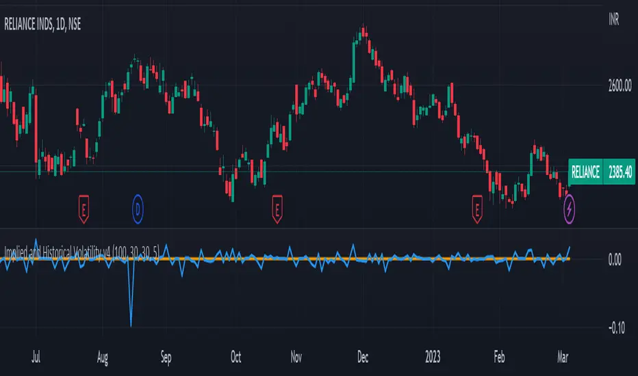
Implied and Historical Volatility v4There is a famous option strategy📊 played on volatility📈. Where people go short on volatility, generally, this strategy is used before any significant event or earnings release. The basic phenomenon is that the Implied Volatility shoots up before the event and drops after the event, while the volatility of the security does not increase in most of the scenarios. 💹
I have tried to create an Indicator using which you
can analyse the historical change in Implied Volatility Vs Historic Volatility.
To get a basic idea of how the security moved during different events.
Notes:
a) Implied Volatility is calculated using the bisection method and Black 76 model option pricing model.
b) For the risk-free rate I have fetched the price of the “10-Year Indian Government Bond” price and calculated its yield to be used as our Risk-Free rate.
SPX Iron Fly Session TrackerOverview
This indicator provides visual tracking for iron fly option structures designed for SPX 0-day-to-expiration (0DTE) intraday trading. It implements a two-phase position management system that adapts to different market conditions throughout the trading day.
This is a visualization and tracking tool only. It does not execute trades, access real options data, or calculate actual profit and loss. All displayed positions are theoretical representations based on underlying price movement.
Strategy Goal and Context
The Core Objective:
The strategy aims to have SPX price expire within your iron fly positions at end of day. When price expires inside a fly's profit zone (between the wings), that position captures maximum premium. The challenge is that price moves throughout the day, so static positioning rarely succeeds.
The Solution: Active Management
Rather than setting positions and hoping price cooperates, this approach continuously manages and repositions flies to keep price centered within your profit zones. As SPX drifts during the trading session, you add new flies at current price levels and close flies that price has moved away from.
The Goal: Multiple Profitable Expirations
By session end, you want as many flies as possible to have price expire within their center zones. This requires:
Adding new flies as price moves away from existing positions
Closing flies when price crosses beyond their optimal range
Building layered coverage in the afternoon to increase probability of capture
Adapting wing widths to time of day and volatility
The Reality: Capital and Time Intensive
This is not a passive strategy. Successful implementation requires:
Substantial capital (each fly requires margin, multiple flies compound this)
Active monitoring throughout trading sessions
Quick decision-making as positions trigger
Multiple position adjustments per session
Disciplined adherence to management rules
How This Indicator Helps:
For backtesting:
Use replay mode to study how positions would have managed on historical sessions
Test different parameter combinations to find optimal settings
Observe position behavior during various market conditions
Understand timing and frequency of position adds and closes
Validate whether your capital can support the required position count
For live session support:
Real-time visual tracking shows current position coverage
Alerts notify you immediately when new positions should be added
Position closure alerts help you manage exits promptly
Reference strike tracking shows where you're measuring movement from
History table provides audit trail of all position activity
The indicator handles the complex tracking and rule application, allowing you to focus on execution and risk management.
Key Use Cases
1. Replay Mode - Backtest and Study
Use TradingView's replay feature to validate the strategy on historical sessions:
Step through past SPX sessions bar-by-bar
See exactly when positions would have opened and closed
Count how many flies would have expired profitably
Analyze different parameter settings on the same historical data
Study position behavior during trending vs ranging conditions
Calculate approximate capital requirements for your setup
Refine your parameters before risking real capital
2. Live Session Alerts
Set up real-time notifications for active trading sessions:
Get alerted immediately when new positions trigger
Receive notifications when positions close
Alerts include strike level, wing width, and closure reason
Works on mobile, desktop, email, or webhook
Never miss a position signal during active trading
Maintain awareness even when away from screens briefly
3. Fully Customizable Parameters
Adapt every aspect to your risk tolerance and capital:
Adjust trigger distances for more or fewer position adds
Modify wing widths for different volatility environments
Change session timing to match your trading schedule
Set maximum concurrent positions to your capital limits
Fine-tune spacing to match available strike increments
Iron Fly Structure
An iron fly is a neutral options strategy with four legs:
- Short 1 ATM Call
- Short 1 ATM Put
- Long 1 OTM Call (upper wing protection)
- Long 1 OTM Put (lower wing protection)
The structure creates a defined risk zone. Maximum profit occurs when price expires at the center strike. Loss increases as price moves toward the wings (breakeven points). Maximum loss is defined and occurs beyond the wings.
Expiration Goal:
You want SPX to close inside the fly's wings. If SPX expires at the strike, you capture maximum premium. If SPX expires between the strike and either wing, you still profit (reduced). If SPX expires beyond the wings, you realize a loss (but it's defined and limited by the wings).
Two-Phase Management System
The indicator tracks positions across two distinct trading phases with different management rules:
Phase 1: TWO_GLASS - Morning Session (Default 10am-1pm ET)
Conservative positioning with active repositioning:
- Trigger new positions when price moves 7.5 points from reference strike (configurable)
- Maintain maximum 2 concurrent positions (configurable)
- 10-point spacing between position strikes (configurable)
- 40-point wing width (configurable)
- Exit rule: When two positions are active and price crosses to one strike level, close the OTHER position
This phase uses a "follow the price" approach. You're not trying to stack multiple positions yet - you're maintaining one or two flies centered on wherever price currently is. As price drifts, you add a new fly at the current level and close the old one when price moves too far away.
Phase 2: THREE_GLASS - Afternoon Session (Default 1pm-4pm ET)
Accumulation mode with layered coverage:
- Trigger new positions every 2.5 points of price movement (configurable)
- Maintain maximum 6 concurrent positions (configurable)
- 5-point spacing between strikes (configurable)
- 20-point wings early, reducing to 10 points after 3pm (configurable)
- Exit rule: Positions only close when price reaches wing extremes
This phase builds a stacked profit zone. Instead of swapping positions, you accumulate multiple flies as price moves. The goal is to have several flies active at expiration, creating a wider net to capture price. Tighter spacing and more frequent triggers create this layered coverage.
Why Two Different Phases?
Morning (Phase 1):
Earlier in the day, price has more time to move substantially. Maintaining many concurrent positions is riskier because price could trend and hit multiple wings. The strategy uses selective positioning with wider wings and active replacement.
Afternoon (Phase 2):
Closer to expiration, price movements typically compress. Time for large moves decreases. The strategy shifts to accumulation, building a net of positions to increase probability that final expiration price falls within at least one (ideally several) of your flies. Tighter wings and more positions become appropriate.
Exit Mechanisms
Strike Cross Exit (Phase 1 Only)
When two positions are active, if price moves to or beyond one position's strike level, the OTHER position closes. This keeps your coverage centered on current price action rather than maintaining positions price has moved away from.
Example: Flies at 5900 and 5910 are open. Price moves to 5910. The fly at 5900 closes because price has moved to the 5910 level. You're now positioned at current price (5910) rather than maintaining coverage at old price (5900).
Wing Extreme Exit (Both Phases)
Any position closes immediately when price touches its upper or lower wing boundary. This represents the breakeven/maximum loss point, so the position is closed to prevent further deterioration.
Dynamic Wing Adjustment
Wing widths automatically adjust based on time of day:
- Phase 1 (Morning): 40 points (customizable)
- Phase 2 Early (1pm-3pm): 20 points (customizable)
- Phase 2 Late (3pm-4pm): 10 points (customizable)
This progressive tightening reflects decreasing price movement potential as expiration approaches. Wider wings earlier provide more protection when price could move substantially. Tighter wings later allow more precise positioning when price movements typically compress.
All values are fully adjustable to match your risk parameters and observed market volatility.
Customization Guide
Every parameter can be modified to suit your trading style, risk tolerance, and capital:
Session Timing
- TWO_GLASS Start Hour: When Phase 1 begins (default: 10am ET)
- THREE_GLASS Start Hour: When Phase 2 begins (default: 1pm ET)
- Wing Width Change Hour: When wings tighten (default: 3pm ET)
- Session End Hour: When tracking stops (default: 4pm ET)
Phase 1 Parameters (Fully Adjustable)
- Trigger Distance: How far price must move from reference strike to add new position (default: 7.5, range: 0.1+)
- Fly Spacing: Distance between position strikes (default: 10, range: 1.0+)
- Wing Width: Distance from strike to wings (default: 40, range: 5.0+)
- Max Flies: Maximum concurrent positions (default: 2, range: 1-10)
Phase 2 Early Parameters (Fully Adjustable)
- Trigger Distance: Movement needed to add new position (default: 2.5, range: 0.1+)
- Fly Spacing: Distance between strikes (default: 5, range: 1.0+)
- Wing Width: Strike to wing distance (default: 20, range: 5.0+)
- Max Flies: Maximum concurrent positions (default: 6, range: 1-20)
Phase 2 Late Parameters
- Wing Width: Reduced width after 3pm (default: 10, range: 5.0+)
General Settings
- Strike Rounding: Round strikes to nearest multiple (default: 5.0, range: 1.0+)
- Bars Before Check: Bars to wait before allowing closure (default: 2, prevents premature exits)
Display Options
- Show History Table: Toggle detailed position log (default: on)
- History Table Rows: Number of positions displayed (default: 15, range: 5-30)
Alert Settings
- Enable Alerts: Toggle notifications for opens/closes (default: on)
How to Use
For Backtesting in Replay Mode:
Select a historical SPX trading session
Apply indicator to 1-5 minute timeframe
Configure your preferred parameters
Activate TradingView's replay feature
Play through the session (step-by-step or continuous)
Observe when positions open (green boxes appear)
Watch position closures (boxes turn gray)
Count how many flies would have expired with price inside (green at session end)
Note total number of position adds throughout session
Calculate approximate capital needed (positions × margin per fly)
Test different parameter combinations on same historical data
Study position behavior during trending vs ranging sessions
For Live Trading Sessions:
Apply indicator to SPX on 1-5 minute timeframe
Configure parameters based on your backtest results
Create alerts for "Iron Fly Opened" and "Iron Fly Closed"
Set alert frequency to "Once Per Bar Close"
Choose notification method (popup, mobile app, email, webhook)
Monitor the status table (top-right) for current session and reference strike
Review history table (bottom-right) for position log with timestamps
When alert triggers, use visual cues to manually place actual option orders
Execute position adds and closes as indicated by the tracker
Visual Interpretation:
Green boxes = Active positions (theoretical profit zones)
White lines (Phase 1) / Aqua lines (Phase 2) = Strike levels
Red/Blue dotted lines = Wing boundaries (breakeven/risk limits)
Gray boxes = Closed positions (historical reference)
Current SPX price line = Shows where price is relative to positions
Top-right table = Current session status, reference strike, open/closed counts
Bottom-right table = Complete position history with open/close timestamps
Alert System Details
The indicator generates detailed alert messages for position management:
Position Opened:
- Strike level where fly should be placed
- Wing width (±points from strike)
- Session phase (Phase 1 or Phase 2)
- Alert format example: "Iron Fly OPENED | Strike: 5900 | Wings: ±40 | Session: TWO_GLASS"
Position Closed:
- Strike level of fly being closed
- Closure reason (strike cross, wing extreme, etc.)
- Session phase
- Alert format example: "Iron Fly CLOSED | Strike: 5900 | Reason: Price crossed to lower fly | Session: TWO_GLASS"
Configure alerts once before market open, then receive automatic notifications as positions trigger throughout the trading session.
Parameter Optimization Suggestions
For Higher Volatility Environments:
- Increase trigger distances (e.g., Phase 1: 10-15 points, Phase 2: 3-5 points)
- Widen wing widths (e.g., Phase 1: 50-60 points, Phase 2: 25-30 points early, 15-20 late)
- Increase strike spacing to reduce position frequency
For Lower Volatility Environments:
- Decrease trigger distances (e.g., Phase 1: 5-7 points, Phase 2: 1.5-2 points)
- Tighten wing widths (e.g., Phase 1: 30-35 points, Phase 2: 15-18 points early, 8-10 late)
- Reduce strike spacing for more granular coverage
For Conservative Risk Management:
- Reduce maximum concurrent positions (Phase 1: 1, Phase 2: 3-4)
- Widen wing widths for more breathing room
- Increase bars before check to avoid whipsaws
- Use wider trigger distances to reduce position frequency
For Aggressive Positioning:
- Increase maximum concurrent positions (Phase 2: 8-10)
- Tighten trigger distances for more frequent adds
- Reduce bars before check for faster responses
- Use tighter spacing to create denser coverage
Capital Considerations:
Remember that each fly requires margin. If Phase 2 allows 6 concurrent flies and each requires $10,000 margin, you need $60,000 in available capital just for position requirements, plus additional cushion for adverse movement.
Use replay mode to count maximum concurrent positions that would have occurred on historical sessions with your parameters, then calculate total capital needed.
Practical Application
This tool provides visual guidance and management support. To implement the strategy:
Backtest thoroughly in replay mode first
Validate capital requirements for your parameter settings
Confirm you can actively monitor positions during trading hours
Use displayed positions as reference for manual order placement
Match indicator parameters to your actual option contracts
Account for real-world factors: commissions, slippage, bid-ask spreads, option availability
Implement proper position sizing based on available capital
Set up alerts before market open to catch all signals
Execute actual trades manually in your brokerage platform
Track actual results versus indicator expectations
Important Limitations
Theoretical tracking only - not an automated trading system
No access to real option prices, Greeks, or implied volatility
No profit/loss calculations or risk metrics
Does not account for time decay (theta), delta, gamma, vega changes
Assumes continuous price action - gaps or halts not handled
Designed for 0DTE SPX options - not suitable for other timeframes or instruments
Assumes option availability at all strike levels - may not reflect reality
Does not model actual option bid/ask spreads or liquidity
Assumes instant execution at desired strikes - slippage not considered
Historical replay shows theoretical behavior only - actual market conditions may differ
Does not adjust for changing implied volatility throughout session
Position count and timing may not match what's executable in real markets
Capital and Time Requirements
This strategy is resource-intensive:
Capital Requirements:
Each iron fly requires margin (varies by broker and strike width)
Multiple concurrent positions multiply capital needs
Example: 6 flies at $10,000 each = $60,000 minimum
Additional cushion needed for adverse movement
Pattern Day Trader rules may apply (requires $25,000 minimum)
Time Requirements:
Active monitoring during trading hours (typically 10am-4pm ET)
Quick response to position add/close signals
Multiple position adjustments per session possible
Cannot be passive or set-and-forget
Requires ability to place orders promptly when alerted
Use replay mode to understand the commitment level before attempting live implementation.
Risk Considerations
Iron fly trading involves substantial risk. This indicator provides visualization and management support only - it does not constitute financial advice or trading recommendations.
Options trading can result in total loss of capital. The indicator's theoretical positions do not reflect actual trading results. Backtest analysis and historical visualization do not guarantee similar future outcomes. Multiple concurrent positions multiply both profit potential and loss risk.
Always conduct independent research, understand all risks, validate capital requirements, and never trade with funds you cannot afford to lose. Consider starting with paper trading to validate execution capability before risking real capital.
Technical Notes
The indicator uses price-based triggers only. It does not:
Connect to options data feeds
Calculate theoretical option values or Greeks
Execute trades automatically
Provide specific trading signals or recommendations
Account for option-specific factors (implied volatility, time decay, bid/ask spreads)
All displayed information represents theoretical position placement based solely on underlying SPX price movement and user-configured parameters. The tool helps visualize the management framework but requires the trader to handle all actual execution and risk management decisions.
This is an educational and analytical tool for understanding iron fly position management concepts. It requires active interpretation, backtesting validation, and manual implementation by the user.

Standard Deviation Levels with Settlement Price and VolatilityStandard Deviation Levels with Settlement Price and Volatility.
This indicator plots the standard deviation levels based on the settlement price and the implied volatility. It works for all Equity Stocks and Futures.
For Futures
Symbol Volatility Symbol (Implied Volatility)
NQ VXN
ES VIX
YM VXD
RTY RVX
CL OVX
GC GVZ
BTC DVOL
The plot gives you an ideas that the price has what probability staying in the range of 1SD,2SD,3SD ( In normal distribution method)
Please provide the feedback or comments if you find any improvements

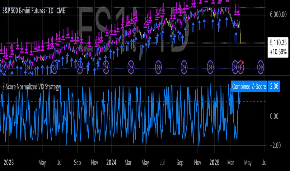
Z-Score Normalized VIX StrategyThis strategy leverages the concept of the Z-score applied to multiple VIX-based volatility indices, specifically designed to capture market reversals based on the normalization of volatility. The strategy takes advantage of VIX-related indicators to measure extreme levels of market fear or greed and adjusts its position accordingly.
1. Overview of the Z-Score Methodology
The Z-score is a statistical measure that describes the position of a value relative to the mean of a distribution in terms of standard deviations. In this strategy, the Z-score is calculated for various volatility indices to assess how far their values are from their historical averages, thus normalizing volatility levels. The Z-score is calculated as follows:
Z = \frac{X - \mu}{\sigma}
Where:
• X is the current value of the volatility index.
• \mu is the mean of the index over a specified period.
• \sigma is the standard deviation of the index over the same period.
This measure tells us how many standard deviations the current value of the index is away from its average, indicating whether the market is experiencing unusually high or low volatility (fear or calm).
2. VIX Indices Used in the Strategy
The strategy utilizes four commonly referenced volatility indices:
• VIX (CBOE Volatility Index): Measures the market’s expectations of 30-day volatility based on S&P 500 options.
• VIX3M (3-Month VIX): Reflects expectations of volatility over the next three months.
• VIX9D (9-Day VIX): Reflects shorter-term volatility expectations.
• VVIX (VIX of VIX): Measures the volatility of the VIX itself, indicating the level of uncertainty in the volatility index.
These indices provide a comprehensive view of the current volatility landscape across different time horizons.
3. Strategy Logic
The strategy follows a long entry condition and an exit condition based on the combined Z-score of the selected volatility indices:
• Long Entry Condition: The strategy enters a long position when the combined Z-score of the selected VIX indices falls below a user-defined threshold, indicating an abnormally low level of volatility (suggesting a potential market bottom and a bullish reversal). The threshold is set as a negative value (e.g., -1), where a more negative Z-score implies greater deviation below the mean.
• Exit Condition: The strategy exits the long position when the combined Z-score exceeds the threshold (i.e., when the market volatility increases above the threshold, indicating a shift in market sentiment and reduced likelihood of continued upward momentum).
4. User Inputs
• Z-Score Lookback Period: The user can adjust the lookback period for calculating the Z-score (e.g., 6 periods).
• Z-Score Threshold: A customizable threshold value to define when the market has reached an extreme volatility level, triggering entries and exits.
The strategy also allows users to select which VIX indices to use, with checkboxes to enable or disable each index in the calculation of the combined Z-score.
5. Trade Execution Parameters
• Initial Capital: The strategy assumes an initial capital of $20,000.
• Pyramiding: The strategy does not allow pyramiding (multiple positions in the same direction).
• Commission and Slippage: The commission is set at $0.05 per contract, and slippage is set at 1 tick.
6. Statistical Basis of the Z-Score Approach
The Z-score methodology is a standard technique in statistics and finance, commonly used in risk management and for identifying outliers or unusual events. According to Dumas, Fleming, and Whaley (1998), volatility indices like the VIX serve as a useful proxy for market sentiment, particularly during periods of high uncertainty. By calculating the Z-score, we normalize volatility and quantify the degree to which the current volatility deviates from historical norms, allowing for systematic entry and exit based on these deviations.
7. Implications of the Strategy
This strategy aims to exploit market conditions where volatility has deviated significantly from its historical mean. When the Z-score falls below the threshold, it suggests that the market has become excessively calm, potentially indicating an overreaction to past market events. Entering long positions under such conditions could capture market reversals as fear subsides and volatility normalizes. Conversely, when the Z-score rises above the threshold, it signals increased volatility, which could be indicative of a bearish shift in the market, prompting an exit from the position.
By applying this Z-score normalized approach, the strategy seeks to achieve more consistent entry and exit points by reducing reliance on subjective interpretation of market conditions.
8. Scientific Sources
• Dumas, B., Fleming, J., & Whaley, R. (1998). “Implied Volatility Functions: Empirical Tests”. The Journal of Finance, 53(6), 2059-2106. This paper discusses the use of volatility indices and their empirical behavior, providing context for volatility-based strategies.
• Black, F., & Scholes, M. (1973). “The Pricing of Options and Corporate Liabilities”. Journal of Political Economy, 81(3), 637-654. The original Black-Scholes model, which forms the basis for many volatility-related strategies.
Bull / Bear Market RegimeBull / Bear Market Regime
Instructions:
- A simple risk on or risk off indicator based on CBOE's Implied Correlation and VIX to highlight and indicate Bull / Bear Markets. To be used with the S&P500 index as that's the source from where the CBOE calculates and measures implied volatility & implied correlation. Can also be used with the other indices such as: Dow Jones, S&P 500, Nasdaq, & Nasdaq100, & Index ETF's such as DIA, SPY, QQQ, etc.
- Know the active regime, see the larger picture using the Daily or Weekly view, and visualize the current "Risk On (Bull) or Risk Off (Bear)" environment.
Description:
- Risk On and Risk Off simplified & visualized. Know if we are in a RISK ON or RISK OFF environment (Bull or Bear Market). (Absolute bottoms and tops will occur BEFORE a Risk On (Bull Market) or Risk Off (Bear Market) environment is confirmed!) This indicator is not meant to bottom tick or uptick market price action, but to show the active regime.
- Green: Bull Market, Risk On, low volatility, and low risk.
- Red: Bear Market, Risk Off, high volatility, and higher risk.
Buy & Sell Indicators (DAILY time frame)
- Nothing is 100% guaranteed! Can be used for short to medium term trades at the users discretion in BEAR MARKETS!!
- These signals are meant to be used during a RISK OFF / BEAR MARKET environment that tends to be accompanied with high volatility. A Risk on / Bull Market environment tends to have low volatility and endless rallies, so the signals will differ and in most instances not apply for Bull market / Risk on regime.
- The SELL signal will more often than not signal that a pullback is near in a BULL market and that a BMR-Bear Market Rally is almost over in a BEAR market.
- The BUY signal will have far more accuracy in a BEAR market-high volatility environment and can Identify short-term and major bottoms.
Always use proper sizing and risk management!

IV Rank & Percentile Suite V1.0What This Indicator Does
The IV Rank & Percentile Suite provides the volatility context options traders need to time entries. It calculates two complementary metrics—IV Rank and IV Percentile—using historical volatility as a proxy, then displays clear visual zones to identify favorable conditions for premium selling strategies.
Stop guessing if volatility is "high" or "low." This indicator tells you exactly where current volatility sits relative to recent history.
The Two Metrics Explained
IV Rank (0-100) Measures where current volatility sits within its 52-week high-low range.
IV Rank = (Current HV - 52w Low) / (52w High - 52w Low) × 100
70 means current volatility is 70% of the way between the yearly low and high
Sensitive to extreme spikes (a single high reading affects the range)
IV Percentile (0-100) Measures what percentage of days in the lookback period had lower volatility than today.
IV Percentile = (Days with lower HV / Total days) × 100
70 means volatility was lower than today on 70% of days in the past year
More stable, less affected by outlier spikes
Why Both?
IV Rank reacts faster to volatility changes. IV Percentile is more stable and statistically robust. When both agree (e.g., both above 50), you have stronger confirmation. Divergence between them can signal transitional periods.
Zone System
The indicator divides readings into three zones:
Zone ------- Default Range ---- Meaning ------------------ Premium Selling
🟢 High ≥ 50 Elevated volatility Favorable
🟡 Neutral 25-50 Normal volatility Selective
🔴 Low ≤ 25 Compressed volatility Avoid
An additional Extreme threshold (default 75) highlights prime conditions when volatility is significantly elevated.
Zone thresholds are fully customizable in settings.
How to Use It
For Premium Sellers (Iron Condors, Credit Spreads, Strangles)
Wait for IV Rank to enter the green zone (≥50)
Confirm IV Percentile agrees (also elevated)
Enter premium selling positions when both metrics align
Avoid initiating new positions when in the red zone
For Premium Buyers (Long Options, Debit Spreads)
Low IV Rank/Percentile means cheaper options
Red zone can favor directional debit strategies
Avoid buying premium when both metrics are in the green zone
General Principle:
Sell premium when volatility is high (it tends to revert to mean). Buy premium when volatility is low (if you have a directional thesis).
Inputs
Volatility Calculation
HV Period — Lookback for historical volatility calculation (default: 20)
Trading Days/Year — 252 for stocks, 365 for crypto
Lookback Periods
IV Rank Lookback — Period for high/low range (default: 252 = 1 year)
IV Percentile Lookback — Period for percentile calculation (default: 252)
Zone Thresholds
High IV Zone — Readings above this are highlighted green (default: 50)
Low IV Zone — Readings below this are highlighted red (default: 25)
Extreme High — Threshold for "prime" conditions alert (default: 75)
Display Options
Toggle IV Rank, IV Percentile, and raw HV display
Show/hide zone backgrounds
Show/hide info panel
Panel position selection
Info Panel
The panel displays:
Field ------- Description
IV Rank ------- Current reading with color coding
IV Pctl ------- Current percentile with color coding
HV 20d ------- Raw historical volatility percentage
52w Range ------- Lowest to highest HV in lookback period
Zone ------- Current zone status
Premium ------- Signal quality for premium selling
Lookback ------- Days used for calculations
R/P Spread ------- Difference between Rank and Percentile
Alerts
Six alerts are available:
Zone Transitions
IV Entered High Zone — Favorable for premium selling
IV Reached Extreme Levels — Prime conditions
IV Dropped to Low Zone — Caution for premium sellers
Threshold Crosses
IV Rank Crossed Above High Threshold
IV Rank Crossed Below Low Threshold
IV Percentile Above 75
IV Percentile Below 25
Set up alerts to get notified when conditions change without watching charts.
Technical Notes
Volatility Calculation Method
This indicator uses close-to-close historical volatility as an IV proxy:
Calculate log returns: ln(Close / Previous Close)
Take standard deviation over HV Period
Annualize: multiply by √(Trading Days)
This method correlates well with implied volatility for most liquid instruments. On highly liquid options underlyings (SPY, QQQ, major stocks), HV and IV tend to move together, making this a reliable proxy for IV Rank analysis.
Non-Repainting
All calculations use confirmed bar data. Values are fixed once a bar closes.
Lookback Requirement
The indicator needs sufficient history to calculate accurately. For a 252-day lookback, ensure your chart has at least 300+ bars of data.
Best Used On
ETFs: SPY, QQQ, IWM, DIA
Indices: SPX, NDX
High-volume stocks: AAPL, TSLA, NVDA, AMD, META
Timeframe: Daily (recommended), Weekly for longer-term view
The indicator works on any instrument but is most meaningful on underlyings with active options markets.
Important Notes
⚠️ This indicator uses historical volatility as a proxy for implied volatility. While HV and IV are correlated, they are not identical. For precise IV data, consult your options broker's platform.
⚠️ High IV Rank does not guarantee profitable premium selling. It indicates favorable conditions, not guaranteed outcomes. Position sizing and risk management remain essential.
⚠️ Past volatility patterns do not guarantee future behavior. Volatility regimes can shift, and historical ranges may not predict future ranges.
Suggested Workflow
Add to daily chart of your preferred underlying
Set up alert for "IV Entered High Zone"
When alerted, check both IV Rank and IV Percentile
If both elevated, evaluate premium selling opportunities
Use your broker's actual IV data for final entry decisions
Questions? Leave a comment below.

ATR Future Movement Range Projection
The "ATR Future Movement Range Projection" is a custom TradingView Pine Script indicator designed to forecast potential price ranges for a stock (or any asset) over short-term (1-month) and medium-term (3-month) horizons. It leverages the Average True Range (ATR) as a measure of volatility to estimate how far the price might move, while incorporating recent momentum bias based on the proportion of bullish (green) vs. bearish (red) candles. This creates asymmetric projections: in bullish periods, the upside range is larger than the downside, and vice versa.
The indicator is overlaid on the chart, plotting horizontal lines for the projected high and low prices for both timeframes. Additionally, it displays a small table in the top-right corner summarizing the projected prices and the percentage change required from the current close to reach them. This makes it useful for traders assessing potential targets, risk-reward ratios, or option strategies, as it combines volatility forecasting with directional sentiment.
Key features:
- **Volatility Basis**: Uses weekly ATR to derive a stable daily volatility estimate, avoiding noise from shorter timeframes.
- **Momentum Adjustment**: Analyzes recent candle colors to tilt projections toward the prevailing trend (e.g., more upside if more green candles).
- **Time Horizons**: Fixed at 1 month (21 trading days) and 3 months (63 trading days), assuming ~21 trading days per month (excluding weekends/holidays).
- **User Adjustable**: The ATR length/lookback (default 50) can be tweaked via inputs.
- **Visuals**: Green/lime lines for highs, red/orange for lows; a semi-transparent table for quick reference.
- **Limitations**: This is a probabilistic projection based on historical volatility and momentum—it doesn't predict direction with certainty and assumes volatility persists. It ignores external factors like news, earnings, or market regimes. Best used on daily charts for stocks/ETFs.
The indicator doesn't generate buy/sell signals but helps visualize "expected" ranges, similar to how implied volatility informs option pricing.
### How It Works Step-by-Step
The script executes on each bar update (typically daily timeframe) and follows this logic:
1. **Input Configuration**:
- ATR Length (Lookback): Default 50 bars. This controls both the ATR calculation period and the candle count window. You can adjust it in the indicator settings.
2. **Calculate Weekly ATR**:
- Fetches the ATR from the weekly timeframe using `request.security` with a length of 50 weeks.
- ATR measures average price range (high-low, adjusted for gaps), representing volatility.
3. **Derive Daily ATR**:
- Divides the weekly ATR by 5 (approximating 5 trading days per week) to get an equivalent daily volatility estimate.
- Example: If weekly ATR is $5, daily ATR ≈ $1.
4. **Define Projection Periods**:
- 1 Month: 21 trading days.
- 3 Months: 63 trading days (21 × 3).
- These are hardcoded but based on standard trading calendar assumptions.
5. **Compute Base Projections**:
- Base projection = Daily ATR × Days in period.
- This gives the total expected movement (range) without direction: e.g., for 3 months, $1 daily ATR × 63 = $63 total range.
6. **Analyze Candle Momentum (Win Rate)**:
- Counts green candles (close > open) and red candles (close < open) over the last 50 bars (ignores dojis where close == open).
- Total colored candles = green + red.
- Win rate = green / total colored (as a fraction, e.g., 0.7 for 70%). Defaults to 0.5 if no colored candles.
- This acts as a simple momentum proxy: higher win rate implies bullish bias.
7. **Adjust Projections Asymmetrically**:
- Upside projection = Base projection × Win rate.
- Downside projection = Base projection × (1 - Win rate).
- This skews the range: e.g., 70% win rate means 70% of the total range allocated to upside, 30% to downside.
8. **Calculate Projected Prices**:
- High = Current close + Upside projection.
- Low = Current close - Downside projection.
- Done separately for 1M and 3M.
9. **Plot Lines**:
- 3M High: Solid green line.
- 3M Low: Solid red line.
- 1M High: Dashed lime line.
- 1M Low: Dashed orange line.
- Lines extend horizontally from the current bar onward.
10. **Display Table**:
- A 3-column table (Projection, Price, % Change) in the top-right.
- Rows for 1M High/Low and 3M High/Low, color-coded.
- % Change = ((Projected price - Close) / Close) × 100.
- Updates dynamically with new data.
The entire process repeats on each new bar, so projections evolve as volatility and momentum change.
### Examples
Here are two hypothetical examples using the indicator on a daily chart. Assume it's applied to a stock like AAPL, but with made-up data for illustration. (In TradingView, you'd add the script to see real outputs.)
#### Example 1: Bullish Scenario (High Win Rate)
- Current Close: $150.
- Weekly ATR (50 periods): $10 → Daily ATR: $10 / 5 = $2.
- Last 50 Candles: 35 green, 15 red → Total colored: 50 → Win Rate: 35/50 = 0.7 (70%).
- Base Projections:
- 1M: $2 × 21 = $42.
- 3M: $2 × 63 = $126.
- Adjusted Projections:
- 1M Upside: $42 × 0.7 = $29.4 → High: $150 + $29.4 = $179.4 (+19.6%).
- 1M Downside: $42 × 0.3 = $12.6 → Low: $150 - $12.6 = $137.4 (-8.4%).
- 3M Upside: $126 × 0.7 = $88.2 → High: $150 + $88.2 = $238.2 (+58.8%).
- 3M Downside: $126 × 0.3 = $37.8 → Low: $150 - $37.8 = $112.2 (-25.2%).
- On the Chart: Green/lime lines skewed higher; table shows bullish % changes (e.g., +58.8% for 3M high).
- Interpretation: Suggests stronger potential upside due to recent bullish momentum; useful for call options or long positions.
#### Example 2: Bearish Scenario (Low Win Rate)
- Current Close: $50.
- Weekly ATR (50 periods): $3 → Daily ATR: $3 / 5 = $0.6.
- Last 50 Candles: 20 green, 30 red → Total colored: 50 → Win Rate: 20/50 = 0.4 (40%).
- Base Projections:
- 1M: $0.6 × 21 = $12.6.
- 3M: $0.6 × 63 = $37.8.
- Adjusted Projections:
- 1M Upside: $12.6 × 0.4 = $5.04 → High: $50 + $5.04 = $55.04 (+10.1%).
- 1M Downside: $12.6 × 0.6 = $7.56 → Low: $50 - $7.56 = $42.44 (-15.1%).
- 3M Upside: $37.8 × 0.4 = $15.12 → High: $50 + $15.12 = $65.12 (+30.2%).
- 3M Downside: $37.8 × 0.6 = $22.68 → Low: $50 - $22.68 = $27.32 (-45.4%).
- On the Chart: Red/orange lines skewed lower; table highlights larger downside % (e.g., -45.4% for 3M low).
- Interpretation: Indicates bearish risk; might prompt protective puts or short strategies.
#### Example 3: Neutral Scenario (Balanced Win Rate)
- Current Close: $100.
- Weekly ATR: $5 → Daily ATR: $1.
- Last 50 Candles: 25 green, 25 red → Win Rate: 0.5 (50%).
- Projections become symmetric:
- 1M: Base $21 → Upside/Downside $10.5 each → High $110.5 (+10.5%), Low $89.5 (-10.5%).
- 3M: Base $63 → Upside/Downside $31.5 each → High $131.5 (+31.5%), Low $68.5 (-31.5%).
- Interpretation: Pure volatility-based range, no directional bias—ideal for straddle options or range trading.
In real use, test on historical data: e.g., if past projections captured actual moves ~68% of the time (1 standard deviation for ATR), it validates the volatility assumption. Adjust the lookback for different assets (shorter for volatile cryptos, longer for stable blue-chips).

Volatility IndicatorThe volatility indicator presented here is based on multiple volatility indices that reflect the market’s expectation of future price fluctuations across different asset classes, including equities, commodities, and currencies. These indices serve as valuable tools for traders and analysts seeking to anticipate potential market movements, as volatility is a key factor influencing asset prices and market dynamics (Bollerslev, 1986).
Volatility, defined as the magnitude of price changes, is often regarded as a measure of market uncertainty or risk. Financial markets exhibit periods of heightened volatility that may precede significant price movements, whether upward or downward (Christoffersen, 1998). The indicator presented in this script tracks several key volatility indices, including the VIX (S&P 500), GVZ (Gold), OVX (Crude Oil), and others, to help identify periods of increased uncertainty that could signal potential market turning points.
Volatility Indices and Their Relevance
Volatility indices like the VIX are considered “fear gauges” as they reflect the market’s expectation of future volatility derived from the pricing of options. A rising VIX typically signals increasing investor uncertainty and fear, which often precedes market corrections or significant price movements. In contrast, a falling VIX may suggest complacency or confidence in continued market stability (Whaley, 2000).
The other volatility indices incorporated in the indicator script, such as the GVZ (Gold Volatility Index) and OVX (Oil Volatility Index), capture the market’s perception of volatility in specific asset classes. For instance, GVZ reflects market expectations for volatility in the gold market, which can be influenced by factors such as geopolitical instability, inflation expectations, and changes in investor sentiment toward safe-haven assets. Similarly, OVX tracks the implied volatility of crude oil options, which is a crucial factor for predicting price movements in energy markets, often driven by geopolitical events, OPEC decisions, and supply-demand imbalances (Pindyck, 2004).
Using the Indicator to Identify Market Movements
The volatility indicator alerts traders when specific volatility indices exceed a defined threshold, which may signal a change in market sentiment or an upcoming price movement. These thresholds, set by the user, are typically based on historical levels of volatility that have preceded significant market changes. When a volatility index exceeds this threshold, it suggests that market participants expect greater uncertainty, which often correlates with increased price volatility and the possibility of a trend reversal.
For example, if the VIX exceeds a pre-determined level (e.g., 30), it could indicate that investors are anticipating heightened volatility in the equity markets, potentially signaling a downturn or correction in the broader market. On the other hand, if the OVX rises significantly, it could point to an upcoming sharp movement in crude oil prices, driven by changing market expectations about supply, demand, or geopolitical risks (Geman, 2005).
Practical Application
To effectively use this volatility indicator in market analysis, traders should monitor the alert signals generated when any of the volatility indices surpass their thresholds. This can be used to identify periods of market uncertainty or potential market turning points across different sectors, including equities, commodities, and currencies. The indicator can help traders prepare for increased price movements, adjust their risk management strategies, or even take advantage of anticipated price swings through options trading or volatility-based strategies (Black & Scholes, 1973).
Traders may also use this indicator in conjunction with other technical analysis tools to validate the potential for significant market movements. For example, if the VIX exceeds its threshold and the market is simultaneously approaching a critical technical support or resistance level, the trader might consider entering a position that capitalizes on the anticipated price breakout or reversal.
Conclusion
This volatility indicator is a robust tool for identifying market conditions that are conducive to significant price movements. By tracking the behavior of key volatility indices, traders can gain insights into the market’s expectations of future price fluctuations, enabling them to make more informed decisions regarding market entries and exits. Understanding and monitoring volatility can be particularly valuable during times of heightened uncertainty, as changes in volatility often precede substantial shifts in market direction (French et al., 1987).
References
• Bollerslev, T. (1986). Generalized Autoregressive Conditional Heteroskedasticity. Journal of Econometrics, 31(3), 307-327.
• Christoffersen, P. F. (1998). Evaluating Interval Forecasts. International Economic Review, 39(4), 841-862.
• Whaley, R. E. (2000). Derivatives on Market Volatility. Journal of Derivatives, 7(4), 71-82.
• Pindyck, R. S. (2004). Volatility and the Pricing of Commodity Derivatives. Journal of Futures Markets, 24(11), 973-987.
• Geman, H. (2005). Commodities and Commodity Derivatives: Modeling and Pricing for Agriculturals, Metals and Energy. John Wiley & Sons.
• Black, F., & Scholes, M. (1973). The Pricing of Options and Corporate Liabilities. Journal of Political Economy, 81(3), 637-654.
• French, K. R., Schwert, G. W., & Stambaugh, R. F. (1987). Expected Stock Returns and Volatility. Journal of Financial Economics, 19(1), 3-29.

IV Rank Oscillator by dinvestorqShort Title: IVR OscSlg
Description:
The IV Rank Oscillator is a custom indicator designed to measure and visualize the Implied Volatility (IV) Rank using Historical Volatility (HV) as a proxy. This indicator helps traders determine whether the current volatility level is relatively high or low compared to its historical levels over a specified period.
Key Features :
Historical Volatility (HV) Calculation: Computes the historical volatility based on the standard deviation of logarithmic returns over a user-defined period.
IV Rank Calculation: Normalizes the current HV within the range of the highest and lowest HV values over the past 252 periods (approximately one year) to generate the IV Rank.
IV Rank Visualization: Plots the IV Rank, along with reference lines at 50 (midline), 80 (overbought), and 20 (oversold), making it easy to interpret the relative volatility levels.
Historical Volatility Plot: Optionally plots the Historical Volatility for additional reference.
Usage:
IV Rank : Use the IV Rank to assess the relative level of volatility. High IV Rank values (close to 100) indicate that the current volatility is high relative to its historical range, while low IV Rank values (close to 0) indicate low relative volatility.
Reference Lines: The overbought (80) and oversold (20) lines help identify extreme volatility conditions, aiding in trading decisions.
Example Use Case:
A trader can use the IV Rank Oscillator to identify potential entry and exit points based on the volatility conditions. For instance, a high IV Rank may suggest a period of high market uncertainty, which could be a signal for options traders to consider strategies like selling premium. Conversely, a low IV Rank might indicate a more stable market condition.
Parameters:
HV Calculation Length: Adjustable period length for the historical volatility calculation (default: 20 periods).
This indicator is a powerful tool for options traders, volatility analysts, and any market participant looking to gauge market conditions based on historical volatility patterns.
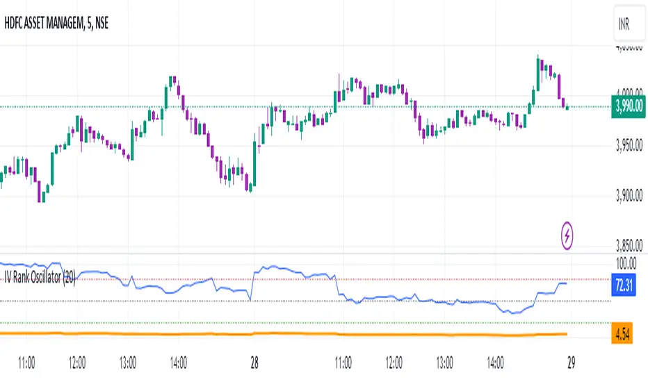
VIX-VXV-Ratio-Buschi
English:
This script shows the ratio between the VIX (implied volatility of SPX options over the next month) and the VXV (implied volatility of SPX options over the next three months). Since in normal "Contango" mode, the VXV should be higher than the VIX, the crossing under 1.0 or maybe 0.95 after a volatility spike could be a sign for a calming market or at least a calming volatility.
Deutsch:
Dieses Skript zeigt das Verhältnis zwischen dem VIX (implizite Volatilität der SPX-Optionen über den nächsten Monat) und dem VXV (implizite Volatilität der SPX-Optionen über die nächsten drei Monate). Da im normalen "Contango"-Modus der VXV höher als der VIX liegen sollte, kann das Abfallen unter 1,0 oder 0,95 nach einer Volatilitätsspitze ein Anzeichen für einen ruhiger werdenden Markt oder zumindest eine ruhiger werdende Volatilität sein.

OHLC Volatility Estimators by @Xel_arjonaDISCLAIMER:
The Following indicator/code IS NOT intended to be a formal investment advice or recommendation by the author, nor should be construed as such. Users will be fully responsible by their use regarding their own trading vehicles/assets.
The embedded code and ideas within this work are FREELY AND PUBLICLY available on the Web for NON LUCRATIVE ACTIVITIES and must remain as is by Creative-Commons as TradingView's regulations. Any use, copy or re-use of this code should mention it's origin as it's authorship.
WARNING NOTICE!
THE INCLUDED FUNCTION MUST BE CONSIDERED AS DEBUGING CODE The models included in the function have been taken from openly sources on the web so they could have some errors as in the calculation scheme and/or in it's programatic scheme. Debugging are welcome.
WHAT'S THIS?
Here's a full collection of candle based (compressed tick) Volatility Estimators given as a function, openly available for free, it can print IMPLIED VOLATILITY by an external symbol ticker like INDEX:VIX.
Models included in the volatility calculation function:
CLOSE TO CLOSE: This is the classic estimator by rule, sometimes referred as HISTORICAL VOLATILITY and is the must common, accepted and widely used out there. Is based on traditional Standard Deviation method derived from the logarithm return of current close from yesterday's.
ELASTIC WEIGHTED MOVING AVERAGE: This estimator has been used by RiskMetriks®. It's calculation is based on an ElasticWeightedMovingAverage Standard Deviation method derived from the logarithm return of current close from yesterday's. It can be viewed or named as an EXPONENTIAL HISTORICAL VOLATILITY model.
PARKINSON'S: The Parkinson number, or High Low Range Volatility, developed by the physicist, Michael Parkinson, in 1980 aims to estimate the Volatility of returns for a random walk using the high and low in any particular period. IVolatility.com calculates daily Parkinson values. Prices are observed on a fixed time interval. n=10, 20, 30, 60, 90, 120, 150, 180 days.
ROGERS-SATCHELL: The Rogers-Satchell function is a volatility estimator that outperforms other estimators when the underlying follows a Geometric Brownian Motion (GBM) with a drift (historical data mean returns different from zero). As a result, it provides a better volatility estimation when the underlying is trending. However, this Rogers-Satchell estimator does not account for jumps in price (Gaps). It assumes no opening jump. The function uses the open, close, high, and low price series in its calculation and it has only one parameter, which is the period to use to estimate the volatility.
YANG-ZHANG: Yang and Zhang were the first to derive an historical volatility estimator that has a minimum estimation error, is independent of the drift, and independent of opening gaps. This estimator is maximally 14 times more efficient than the close-to-close estimator.
LOGARITHMIC GARMAN-KLASS: The former is a pinescript transcript of the model defined as in iVolatility . The metric used is a combination of the overnight, high/low and open/close range. Such a volatility metric is a more efficient measure of the degree of volatility during a given day. This metric is always positive.

Volatility Regime NavigatorA guide to understanding VIX, VVIX, VIX9D, VVIX/VIX, and the Composite Risk Score
1. Purpose of the Indicator
This dashboard summarizes short-term market volatility conditions using four core volatility metrics.
It produces:
• Individual readings
• A combined Regime classification
• A Composite Risk Score (0–100)
• A simplified Risk Bucket (Bullish → Stress)
Use this to evaluate market fragility, drift potential, tail-risk, and overall risk-on/off conditions.
This is especially useful for intraday ES/NQ trading, expected-move context, and understanding when breakouts or fades have edge.
2. The Four Core Volatility Inputs
(1) VIX — Baseline Equity Volatility
• < 16: Complacent (easy drift-up, but watch for fragility)
• 16–22: Healthy, normal volatility → ideal trading conditions
• > 22: Stress rising
• > 26: Tail-risk / risk-off environment
(2) VIX9D — Short-Term Event Vol
Measures 9-day implied volatility. Reacts to immediate news/events.
• < 14: Strongly bullish (drift regime)
• 14–17: Bullish to neutral
• 17–20: Event risk building
• > 20: Short-term stress / caution
(3) VVIX — Volatility of VIX (fragility index)
Tracks volatility of volatility.
• < 100: “Bullish, Bullish” — very low fragility
• 100–120: Normal
• 120–140: Fragile
• > 140: Stress, hedging pressure
(4) VVIX/VIX Ratio — Microstructure Risk-On/Risk-Off
One of the most sensitive indicators of market confidence.
• 5.0–6.5: Strongest “normal/bullish” zone
• < 5.0: Bottom-stalking / fear regime
• > 6.5: Complacency → vulnerable to reversals
• > 7.5: Fragile / top-risk
3. Composite Risk Score (0–100)
The dashboard converts all four inputs into a single score.
Score Interpretation
• 80–100 → Bullish - Drift regime. Shallow pullbacks. Upside favored.
• 60–79 → Normal - Healthy tape. Balanced two-way trading.
• 40–59 → Fragile - Choppy, failed breakouts, thinner liquidity.
• 20–39 → Risk-Off - Downside tails active. Favor fades and defensive behavior.
• < 20 → Stress - Crisis or event-driven tape. Avoid longs.
Score updates every bar.
4. Regime Label
Independent of the composite score, the script provides a Regime classification based on combinations of VIX + VVIX/VIX:
• Bullish+ → Buying is easy, tape lifts passively
• Normal → Cleanest and most tradable conditions
• Complacent → Top-risk; be careful chasing upside
• Mixed → Signals conflict; chop potential
• Bottom Stalk → High VIX, low VVIX/VIX (capitulation signatures)
A trailing “+” or “*” indicates additional bullish or caution overlays from VIX9D/VVIX.
5. How to Use the Dashboard in Trading
When Bullish (Score ≥ 80):
• Expect drift-up behavior
• Downside limited unless catalyst hits
• Structure favors breakouts and trend continuation
• Mean reversion trades have lower expectancy
When Normal (Score 60–79):
• The “playbook regime”
• Breakouts and mean reversion both valid
• Best overall trading environment
When Fragile (Score 40–59):
• Expect chop
• Breakouts fail
• Take quicker profits
• Avoid overleveraged directional bets
When Risk-Off (20–39):
• Favor fades of strength
• Downside tails activate
• Trend-following short setups gain edge
• Respect volatility bands
When Stress (<20):
• Avoid long exposure
• Do not chase dips
• Expect violent, news-sensitive behavior
• Position sizing becomes critical
6. Quick Summary
• VIX = weather
• VIX9D = short-term storm radar
• VVIX = foundation stability
• VVIX/VIX = confidence vs fragility
• Composite Score = overall regime health
• Risk Bucket = simple “what do I do?” label
This dashboard gives traders a high-confidence, low-noise view of equity volatility conditions in real time.
Historical VolatilityHistorical Volatility Indicator with Custom Trading Sessions
Overview
This indicator calculates **annualized Historical Volatility (HV)** using logarithmic returns and standard deviation. Unlike standard HV indicators, this version allows you to **customize trading sessions and holidays** for different markets, ensuring accurate volatility calculations for options pricing and risk management.
Key Features
✅ Custom Trading Sessions - Define multiple trading sessions per day with precise start/end times
✅ Multiple Markets Support - Pre-configured for US, Russian, European, and crypto markets
✅ Clearing Periods Handling - Account for intraday clearing breaks
✅ Flexible Calendar - Set trading days per year for different countries
✅ All Timeframes - Works correctly on intraday, daily, weekly, and monthly charts
✅ Info Table - Optional display showing calculation parameters
How It Works
The indicator uses the classical volatility formula:
σ_annual = σ_period × √(periods per year)
Where:
- σ_period = Standard deviation of logarithmic returns over the specified period
- Periods per year = Calculated based on actual trading time (not calendar time)
Calculation Method
1. Computes log returns: ln(close / close )
2. Calculates standard deviation over the lookback period
3. Annualizes using the square root rule with accurate period count
4. Displays as percentage
Settings
Calculation
- Period (default: 10) - Lookback period for volatility calculation
Trading Schedule
- Trading Days Per Year (default: 252) - Number of actual trading days
- USA: 252
- Russia: 247-250
- Europe: 250-253
- Crypto (24/7): 365
- Trading Sessions - Define trading hours in format: `hh:mm:ss-hh:mm:ss, hh:mm:ss-hh:mm:ss`
Display
- Show Info Table - Shows calculation parameters in real-time
Market Presets
United States (NYSE/NASDAQ)
Trading Sessions: 09:30:00-16:00:00
Trading Days Per Year: 252
Trading Minutes Per Day: 390
Russia (MOEX)
Trading Sessions: 10:00:00-14:00:00, 14:05:00-18:40:00
Trading Days Per Year: 248
Trading Minutes Per Day: 515
Europe (LSE)
Trading Sessions: 08:00:00-16:30:00
Trading Days Per Year: 252
Trading Minutes Per Day: 510
Germany (XETRA)
Trading Sessions: 09:00:00-17:30:00
Trading Days Per Year: 252
Trading Minutes Per Day: 510
Cryptocurrency (24/7)
Trading Sessions: 00:00:00-23:59:59
Trading Days Per Year: 365
Trading Minutes Per Day: 1440
Use Cases
Options Trading
- Compare HV vs IV - Historical volatility compared to implied volatility helps identify mispriced options
- Volatility mean reversion - Identify when volatility is unusually high or low
- Straddle/strangle selection - Choose optimal strikes based on historical movement
Risk Management
- Position sizing - Adjust position size based on current volatility
- Stop-loss placement - Set stops based on expected price movement
- Portfolio volatility - Monitor individual asset volatility contribution
Market Analysis
- Regime identification - Detect transitions between low and high volatility environments
- Cross-market comparison - Compare volatility across different assets and markets
Why Accurate Trading Hours Matter
Standard HV indicators assume 24-hour trading or use simplified day counts, leading to significant errors in annualized volatility:
- 5-minute chart error : Can be off by 50%+ if using wrong period count
- Options pricing impact : Even 2-3% HV error affects option values substantially
- Intraday vs overnight : Correctly excludes non-trading periods
This indicator ensures your HV calculations match the methodology used in professional options pricing models.
Technical Notes
- Uses actual trading minutes, not calendar days
- Handles multiple clearing periods within a single trading day
- Properly scales volatility across all timeframes
- Logarithmic returns for more accurate volatility measurement
- Compatible with Pine Script v6
Author Notes: This indicator was designed specifically for options traders who need precise volatility measurements across different global markets. The customizable trading sessions ensure your HV calculations align with actual market hours and industry-standard options pricing models.
4C Options Expected Move (Weekly + 0DTE)This indicator plots the calculated Expected Move for BOTH Weekly and Zero Dated Expiration (0DTE) Daily options, for a quick visual reference.
Please Note: This indicator is different from our original "4C Expected Move (Weekly Options)" indicator, as it now packages the ability to ALSO plot 0DTE options expected moves along with Weekly expected moves. Many other newer features have also been implemented.
Background Information
The Expected Move (EM) is the amount that a stock is predicted to increase or decrease from its current price, based on the current level of options pricing and implied volatility.
This range can be viewed as possible support and resistance, or, once price gets outside of the range, institutional hedging actions can accelerate the move in that direction.
It can be useful to know what the weekly EM range is for a stock to understand the probabilities of the overall distance, direction and volatility for the week.
About the Indicator
This indicator plots the calculated Expected Move for BOTH Weekly and Zero Dated Expiration (0DTE) options, for a quick visual reference.
For the weekly EM, the range is based on the Weekly close of the prior week.
For the Daily EM based on 0DTE options, the range is based on the Daily close of the prior day.
The indicator will automatically start a new weekly EM plot at the beginning of the week, and a new daily EM at the beginning of each day.
The EM values must be updated weekly and/or daily.
Features
Plots the EM for the week
Plots the EM for the day, for symbols that offer daily expiration options
Plots the 2 Standard Deviation EM for both the weekly and daily EM
Labels with calculated values are plotted near the levels for quick visual aid
Settings
Can toggle weekly EM on/off
Can toggle Daily EM on/off
Can toggle 2 Standard Deviation lines on/off
Can toggle labels for all EM on/off
Robust line settings
Can adjust label location left/right based on personal preference
Can enter symbol into settings as a reference
Handy instructions in the settings
How To Set Up The Indicator
To use this indicator you must have access to a broker with options data (not available on Tradingview).
Usually, you can look at the stock's option chain to find the weekly expected move.
You will have to do your own research to find where this information is displayed depending on your broker. You may also need to find the information elsewhere if your broker does not have this information.
You can also do your calculation of the EM using the following formula (please do your own research):
Expected Move = Option Price x Implied Volatility x Square Root of Time
See screenshot example below
This is the Thinkorswim platform's option chain, and the Implied Volatility % and the calculated EM are on the right side of the option chain.
The Expected Move is circled in blue. Use the +- number in parentheses, NOT the % value.
For the weekly EM, input the number that corresponds to the weekly option into the indicator. This must be done on a weekly basis, and It is typically best to use the EM for the next week expiration that is generated AFTER the Friday close and/or before the Monday open of the upcoming week.
For the daily EM, input the number that corresponds to the daily 0DTE option into the indicator. This must be done on a daily basis, and it is typically best to use the EM value for the 0DTE option that is generated the night before (after market close), or before the market opens for that 0DTE. .